-modified.png)
Making timely payments across multiple accounts can be a real challenge for many users, and banks want to avoid late or missed payments as much as possible.


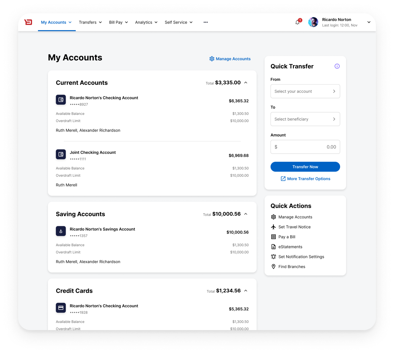
I was the main UX designer on this project working with 1 PO, 1 BA, 1 UX researcher, and two teams of developers (web and mobile). Our stakeholders included the Product Manager for Retail Banking, the Product Manager for Business Banking, and our Customer Success team.
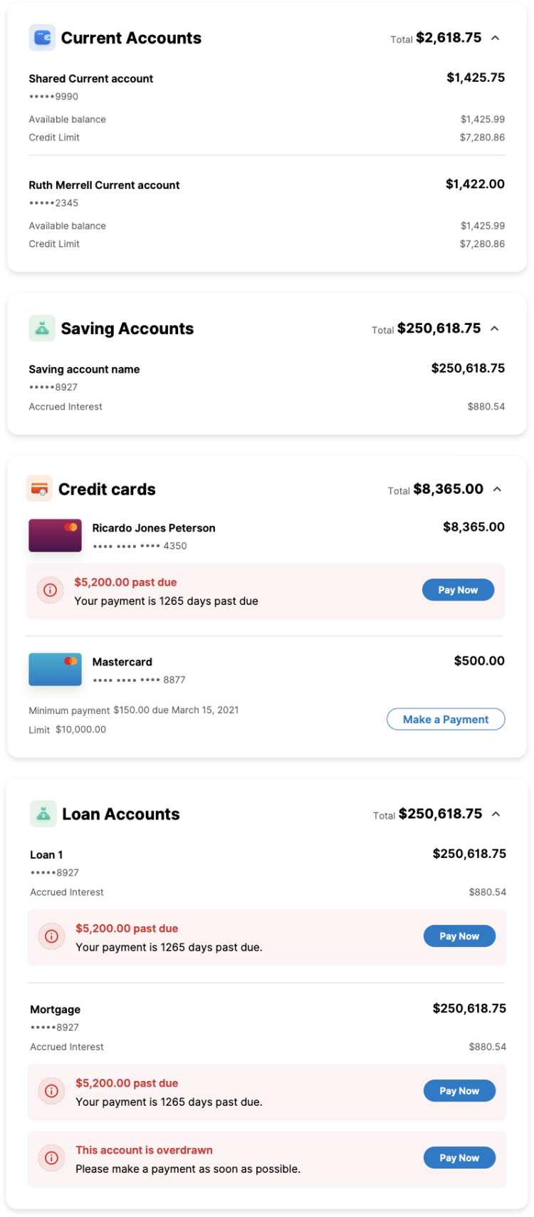
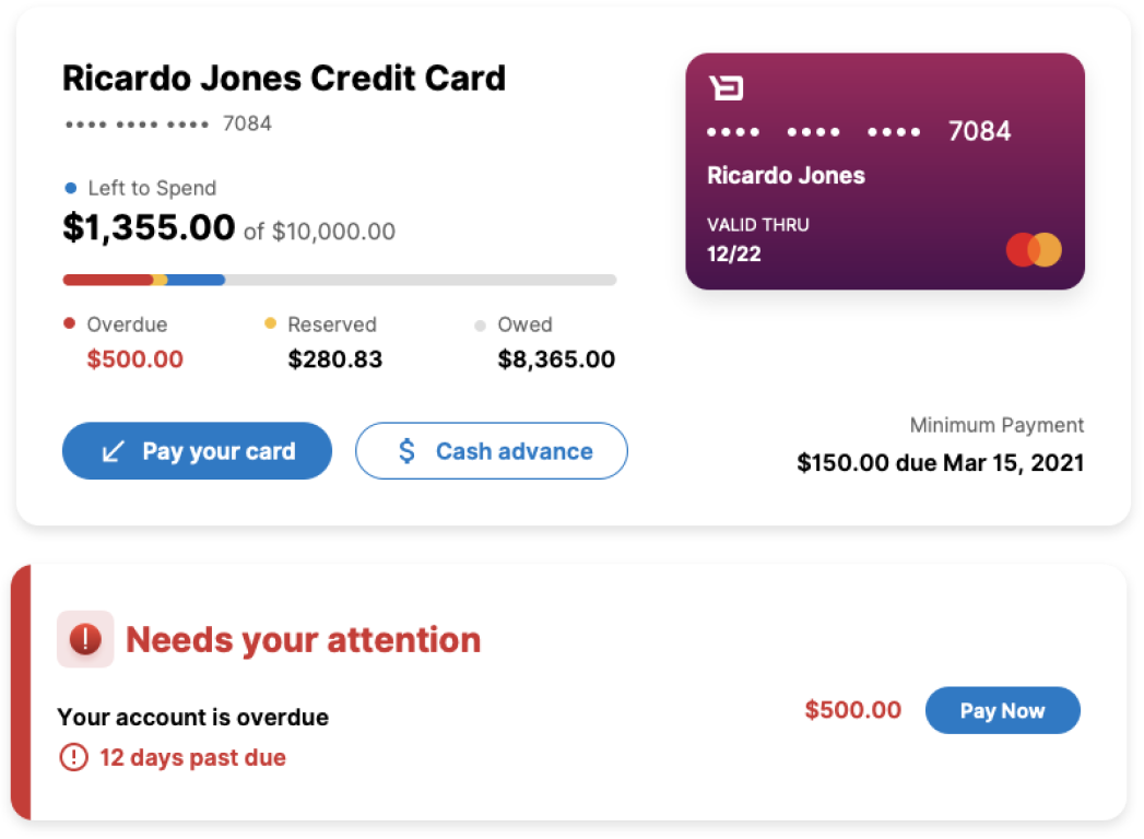
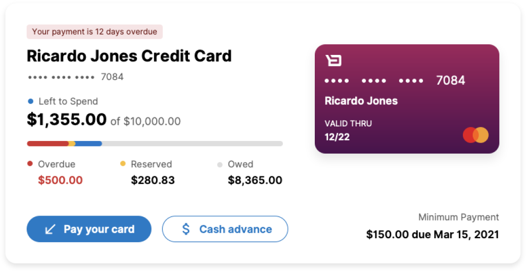
Our interface didn’t have a way of highlighting accounts that had missed payments, so it was easy for users to assume that everything was fine across their accounts.
We wanted to provide a solution that would alert users to an issue and allow them to resolve it quickly by making a payment where necessary.
In this option we placed all of the overdue information into a red nudge directly below the account.
Pros:
- Accounts maintain their original order at all times
- Overdue information is placed contextually
- Subtle, but still noticeable
- Credit Card accounts retail their visuals
Cons:
- Nudge component not part of design system (would need to be added)
- If a user has a lot of accounts to scroll through, they could still miss the alert
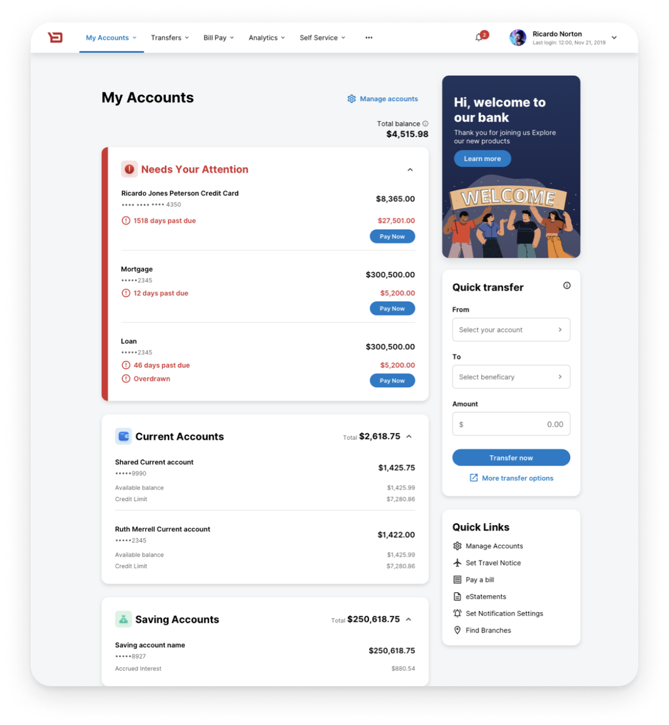
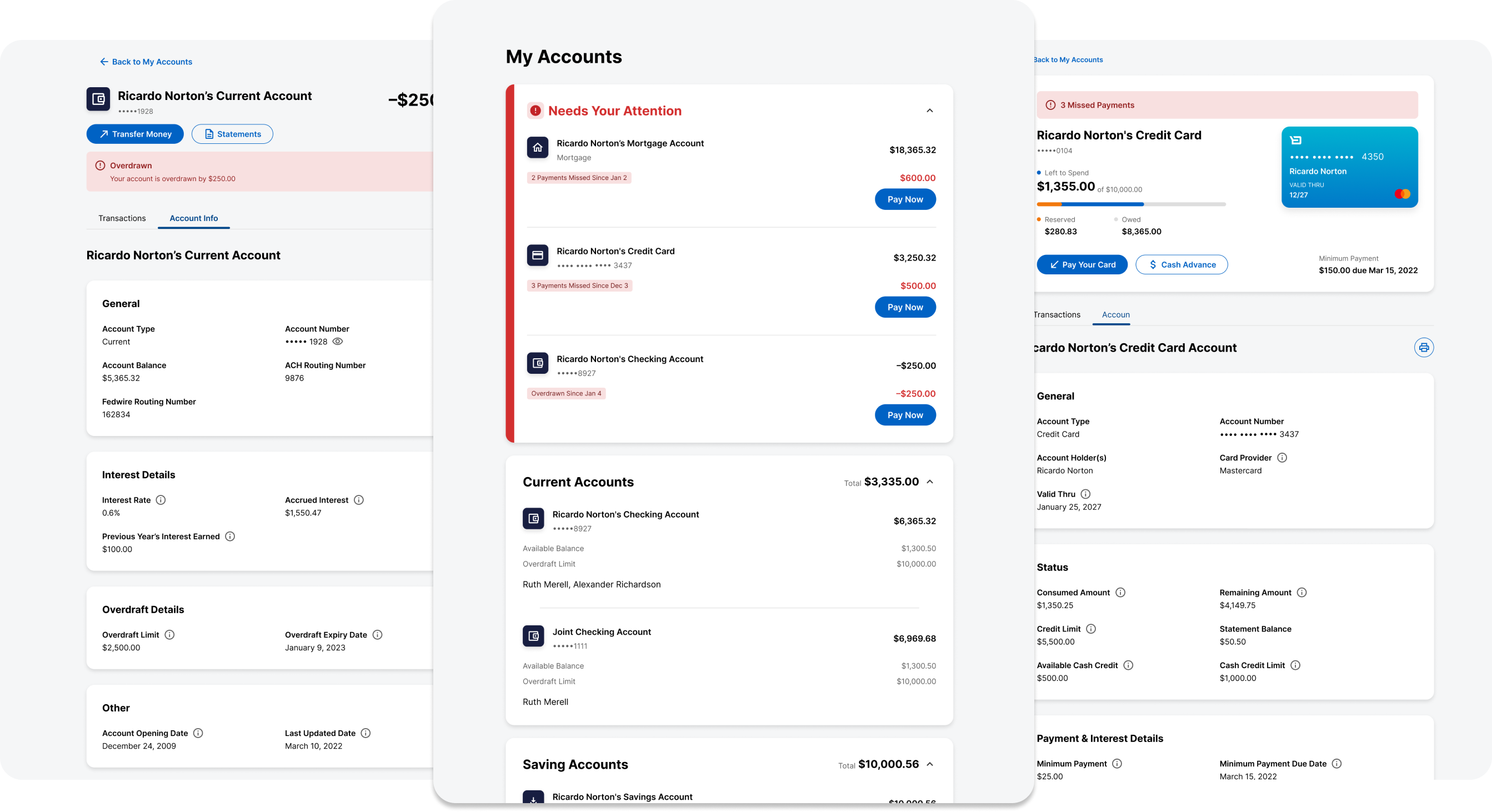
In this option, all overdue accounts would move into a separate container at the very top of the list.
Pros:
- Very noticeable! Users will not miss these alerts
- Pushes a user to make a payment in order to move their account out of this container
Cons:
- Might be disorienting to users that their accounts are moving to a different container
- We would have to change the way credit card accounts are displayed between the two sections
- What if our users regularly have accounts in the red? Will this section become annoying?
Research into the latest debt statistics helped us understand how often Americans are late on their payments.
- Fewer people are late on their mortgage payments every year
- A late payment on a mortgage will be an edge case
- 18-29 year olds are most likely to be late on their credit card payment
- Fewer people are late on their credit card payments every year
- Missed payments on credit cards are expected

We conducted two rounds of user testing (10-15 participants each) to figure out which option users found most helpful. Most of our questions focused on the separate container option, exploring if users would understand why accounts move between different sections in their overview.

Understood that there was an issue with an account faster when it was in a separate container at the top.
Would like push notifications when a payment is missed
Liked that relevant accounts move to the top when there is something wrong with them
Would be nice if interface pushed to set-up autopay if you are regularly overdue.
I like that I can pay it off directly from the alert

"Past due" wording is confusing
Why is left to spend highlighted inside of an account? I would prefer to see how much I owe
In this design, we experimented with placing all of the overdue information into a separate container. While it has a lot of consistency with the “Needs your attention” section in the account overview, it also takes up quite a bit of room.
Here we placed all of the overdue information into an eye-catching alert at the top of the account. The type of information we are highlighting aligns well with our intended use of the alert component

We wanted to create a very minimalist option, so we figured out a way to condense the overdue information into a small badge at the top of the account. It succeeded in being a sleek way of communicating an issue without it being too overpowering.